TEN IMAGES THAT I FIND
INTERESTING
(not just illustration)
PARTS 6-10.
INTERESTING
(not just illustration)
PARTS 6-10.
6

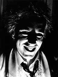
(Photograph: Johnny Rotten by Dennis Morris)
The photo is interesting to me because of the strong contrastring tones produced by the light. I think Rotten must have been playing with a torch, his face almost looks like a strange rubber mask, and has a sinister and deranged feel to it. I think this is because you can see most of the detail of his face apart from his eyes, so the viewer feels there is something being held back from them and a deeper sense of wrongness present.
7

(Ralph Steadman illustrations for Hunter S Thompson's 'Fear & Loathing in Las Vegas' - first published in Rolling Stone magazine).
To me, Steadman's drawings accompany Hunter S Thompson's writing style brilliantly. His stories of drug-fuelled episodes laden with paranoia and confusion being met by scratchy and somewhat disturbing imagery, such as HST and his "attorney" speeding accross desert roads bubbles spewing from their heads to represent their inibriated mindframes.
I love the bottom image (of cops at a police convention about drugs, which Thompson and his "attorney" attended, on drugs).
8

('Catzilla'? -digital photo collage , Unknown Artist)
This piece of digital collage, unlike many similar pieces made in colour, rather than black and white, actually looks realistic because of the lighting and shadows. I also find this image to be humourous because of the way the cat is playing with the car as if it was a toy.
9

('Margaret Thatcher - Where Am I Now?' ...and everything else by Steve Bell.)
His cynicism in dialogue and vicious-ness in caricature makes Steve Bell the best, in my opinion, at mocking political figures. This one of Thatcher is my favourite. Without doing much, he has shown her for a psychotic wreck, desperately trying to claw back her "glory days" and remain in the public eye. His drawing style is loose but effective, for example the no. 10 door differs slightly from frame to frame, he isn't particularly worried about all the lines within (and bordering) the images being dead straight. It's this loose style that makes his cartoons look lively and oddball.
10

(Gee Vaucher - Gatefold cover of "Bullshit Dectector Volume 2" Compilation on CRASS records)
Vaucher's work early for the band (and label) Crass, was mostly cut 'n' paste collage. The subject is generally anarchistic in sentiment. Much of her work uses 70s and 80s imagery of oppression and governments, such as atomic-bomb mushroom-clouds, the police, Thatcher, etc.
This particular album cover, for a compilation on Crass records, is one of my favourite examples of Vaucher's work, using an original image of members of the royal family, in full regalia and decorated with medals and such.
She has replaced every face with a skull and applied the text:
"THE RULING clARSES?"(sic)
"RIGHT! HANDS UP ALL THOSE WHO CAN SMELL BULLSHIT"
which is great, because in the original image, a few of them must have been waving to the camera and have their hands raised. So she has used their imagery, twisted it and added her own ideas, and given it back as something intended to mock them. I see Crass and Gee Vaucher as the pre-cursor to subvertising. Below is a more recent piece of Vaucher's work.

