TEN IMAGES THAT I FIND INTERESTING
(not just illustration)
PARTS 1-5
by Colm Clafferty
(not just illustration)
PARTS 1-5
by Colm Clafferty
1

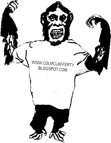
This image, made using fineliner and coffee, is one of my favourite examples of illustration from the internet. What i like most about it is the depth of field created by shadows and shading, particularly on the arms. Using coffee as a watercolour tone is also an idea that interests me not only because of its quirkiness but because it seems to be quite a multi-tonal media.
2

(illustration entitled "head", by David Foldvari)
David Foldvari works a lot in black and white, often with photorealistic figures and faces. Foldvari's use of line is really crisp and strong. In his work, he leaves rough background textures that look like photocopier marks and smudges, he also uses paint drips which give some of his work a "street art" illustration feel. I am interested by this piece especially because of its sinister quality, the head being featureless apart from a set of teeth, that do not seem to be connected to a skull. It reminds me of one of the zombies from dawn of the dead.
3
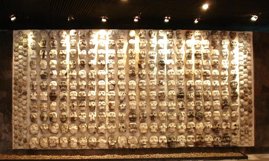
I was amazed when I saw this. Skulls are one of my favourite subjects to draw and are a major part of punk/metal (..and pirate) aesthetic and have been used since medieval times to represent mortality (and subsequently danger) In early south american cultures, walls of real human skulls would be displayed to show sacrifices to the gods (and probably also to strike fear into more weak-hearted opponents!). The kind of naive sculptural style of the skulls is probably a precursor to the style of statues (as below), models and masks used in the "day of the dead" celebrations to this day.

4

This is my favourite Andrew Rae illustration (apart from stuff on Monkey Dust) . It is set out like a medical diagram of the human make-up, only Rae has added his own annotations pointing to different parts of the body. Some of these use play on words, others are play on sound. My favourite ones are "FTSE 100" (instead of Foot) and "Abomination" (instead of Abdomen). My favourite work is that which incorporates humour into the actual illustration and this is why Rae's work is appealing to me.
5


(Old school tattoos, Swallows)
I find swallow tattoos interesting, not only because they are aesthetically pleasing, but also because of the history and legend behind them. Supposedly, each swallow represents the achievment of travelling 5000 nautical miles (this would have been extremely dangerous and difficult in the early days of sailing), two swallows meaning 10,000. Swallows are also a symbol of freedom, because of their unique shape and flight.
My favourite part of a swallow tattoo is the eye and the line that curls out seperating two colours on the head. The shading is also an important part. I think the bottom image has really effective shading, especially on the base of the swallow's body and its wings.
Another important aspect of tattoos is the composition. For me, the top image has the stronger composition because it uses up the corner right angle shape and looks like half of a pair.