Tuesday, 2 September 2008

TEN IMAGES (six to ten)

TEN IMAGES THAT I FIND
INTERESTING
(not just illustration)
PARTS 6-10.


6


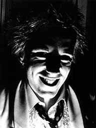
(Photograph: Johnny Rotten by Dennis Morris)
The photo is interesting to me because of the strong contrastring tones produced by the light. I think Rotten must have been playing with a torch, his face almost looks like a strange rubber mask, and has a sinister and deranged feel to it. I think this is because you can see most of the detail of his face apart from his eyes, so the viewer feels there is something being held back from them and a deeper sense of wrongness present.


7


(Ralph Steadman illustrations for Hunter S Thompson's 'Fear & Loathing in Las Vegas' - first published in Rolling Stone magazine).
To me, Steadman's drawings accompany Hunter S Thompson's writing style brilliantly. His stories of drug-fuelled episodes laden with paranoia and confusion being met by scratchy and somewhat disturbing imagery, such as HST and his "attorney" speeding accross desert roads bubbles spewing from their heads to represent their inibriated mindframes.
I love the bottom image (of cops at a police convention about drugs, which Thompson and his "attorney" attended, on drugs).

8


('Catzilla'? -digital photo collage , Unknown Artist)
This piece of digital collage, unlike many similar pieces made in colour, rather than black and white, actually looks realistic because of the lighting and shadows. I also find this image to be humourous because of the way the cat is playing with the car as if it was a toy.


9


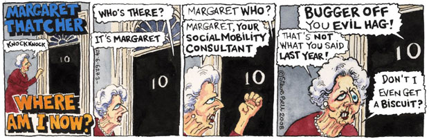
('Margaret Thatcher - Where Am I Now?' ...and everything else by Steve Bell.)
His cynicism in dialogue and vicious-ness in caricature makes Steve Bell the best, in my opinion, at mocking political figures. This one of Thatcher is my favourite. Without doing much, he has shown her for a psychotic wreck, desperately trying to claw back her "glory days" and remain in the public eye. His drawing style is loose but effective, for example the no. 10 door differs slightly from frame to frame, he isn't particularly worried about all the lines within (and bordering) the images being dead straight. It's this loose style that makes his cartoons look lively and oddball.
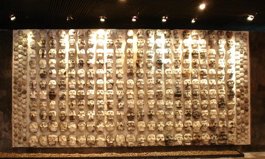

10


(Gee Vaucher - Gatefold cover of "Bullshit Dectector Volume 2" Compilation on CRASS records)

Vaucher's work early for the band (and label) Crass, was mostly cut 'n' paste collage. The subject is generally anarchistic in sentiment. Much of her work uses 70s and 80s imagery of oppression and governments, such as atomic-bomb mushroom-clouds, the police, Thatcher, etc.
This particular album cover, for a compilation on Crass records, is one of my favourite examples of Vaucher's work, using an original image of members of the royal family, in full regalia and decorated with medals and such.
She has replaced every face with a skull and applied the text:
"THE RULING clARSES?"(sic)
"RIGHT! HANDS UP ALL THOSE WHO CAN SMELL BULLSHIT"
which is great, because in the original image, a few of them must have been waving to the camera and have their hands raised. So she has used their imagery, twisted it and added her own ideas, and given it back as something intended to mock them. I see Crass and Gee Vaucher as the pre-cursor to subvertising. Below is a more recent piece of Vaucher's work.

Tuesday, 26 August 2008

TEN IMAGES (one to five)

TEN IMAGES THAT I FIND INTERESTING
(not just illustration)

PARTS 1-5

by Colm Clafferty

1


(illustration of Leroy 'horsemouth' Wallace, reggae drummer, by Thijshere from Netherlands. I found this on Flickr.com)

This image, made using fineliner and coffee, is one of my favourite examples of illustration from the internet. What i like most about it is the depth of field created by shadows and shading, particularly on the arms. Using coffee as a watercolour tone is also an idea that interests me not only because of its quirkiness but because it seems to be quite a multi-tonal media.

2


(illustration entitled "head", by David Foldvari)

David Foldvari works a lot in black and white, often with photorealistic figures and faces. Foldvari's use of line is really crisp and strong. In his work, he leaves rough background textures that look like photocopier marks and smudges, he also uses paint drips which give some of his work a "street art" illustration feel. I am interested by this piece especially because of its sinister quality, the head being featureless apart from a set of teeth, that do not seem to be connected to a skull. It reminds me of one of the zombies from dawn of the dead.


3


(Photo of a Tzompantli ("wall of skulls") in Mexico City, from wikipedia)

I was amazed when I saw this. Skulls are one of my favourite subjects to draw and are a major part of punk/metal (..and pirate) aesthetic and have been used since medieval times to represent mortality (and subsequently danger) In early south american cultures, walls of real human skulls would be displayed to show sacrifices to the gods (and probably also to strike fear into more weak-hearted opponents!). The kind of naive sculptural style of the skulls is probably a precursor to the style of statues (as below), models and masks used in the "day of the dead" celebrations to this day.


4


(Illustration entitled "The Human Body" by Andrew Rae of Peepshow collective)

This is my favourite Andrew Rae illustration (apart from stuff on Monkey Dust) . It is set out like a medical diagram of the human make-up, only Rae has added his own annotations pointing to different parts of the body. Some of these use play on words, others are play on sound. My favourite ones are "FTSE 100" (instead of Foot) and "Abomination" (instead of Abdomen). My favourite work is that which incorporates humour into the actual illustration and this is why Rae's work is appealing to me.


5


(Old school tattoos, Swallows)


I find swallow tattoos interesting, not only because they are aesthetically pleasing, but also because of the history and legend behind them. Supposedly, each swallow represents the achievment of travelling 5000 nautical miles (this would have been extremely dangerous and difficult in the early days of sailing), two swallows meaning 10,000. Swallows are also a symbol of freedom, because of their unique shape and flight.
My favourite part of a swallow tattoo is the eye and the line that curls out seperating two colours on the head. The shading is also an important part. I think the bottom image has really effective shading, especially on the base of the swallow's body and its wings.
Another important aspect of tattoos is the composition. For me, the top image has the stronger composition because it uses up the corner right angle shape and looks like half of a pair.